OverviewSo far in this series we have looked at what color temperature is, how color temperature is determined by spectral content, and the temperatures to expect from some common light sources. This posting gets more practical with a little experiment to show the effect of color temperature on what we get from the camera.
For this experiment, I have made five sets of photos, all with the camera set for daylight color balance. This tells the camera that we are using sunlight, so it adjusts the color balance accordingly. Using the same setting for all of the photos allows us to see the differences between light sources. The setup includes a calibrated color check chart so we can see the effect on color rendering. It also includes a QP Card, which has patches for near black, middle gray, and near white. The white patch gives a good visual representation of the light's color. The middle gray patch will be used for making RGB color balance measurements to assess each light sources color rendering.
Bear in mind that the interpretation of spectral content for sunlight is controlled by the camera manufacturer, Canon. The following images are from in-camera jpeg files. The camera is a Canon 450D. I set the camera's preset to “Faithful”, which sets all of the color and contrast controls to zero.
As you probably already know, the Seattle area has a reputation for having the most consecutive overcast days per year compared to any other state in the union. Few places can claim more cloudy days than us. We have some of the happiest slugs on earth... but I digress. What I meant to say is that by chance, it was a near cloudless day, so I was able to get outside and make the sunlight photo in bright, 11:00 A.M. sun. Sometimes things just work out :-)
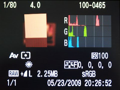
Lightsource: Sunlight at 11:00 A.M. on a near cloudless day.
The colors in the chart are clearly discernible and the white balance card shows what appear to be neutral white and gray patches with no obvious color cast. Using the color picker to take a measurement on the middle gray patch, I get (96, 97, 99), which is close to a perfectly neutral gray.
Our other clue to good color balance is seen in the Red, Green, and Blue histograms.
The between the Red, Green, and Blue histograms. The three histograms show the same basic distribution of pixels at about the same luminance. This is good enough to use with no additional white-balance adjustment.
Lightsource: 150W Halogen Incandescent light bulb (modeling lamp from a monolight). I didn't have any regular incandescent bulbs on hand, so I used the modeling lamp from one of my studio lights. It is no different from any normal halogen bulb except that it has an additional layer of glass to make it safer (JDD style). The spectral output is virtually the same as for an ordinary incandescent light bulb. They both burn a filament to create light. The only difference is that for one, the filament burns in a vacuum and for the other it burns in halogen gas.
Back to our analysis. Notice that the white balance card shows a distinct reddish tint and the colors in the chart are badly skewed toward red. I don't need to make a measurement to know that the color is off considerably. Nonetheless, using the color picker to take a measurement on the middle gray patch, I get (140, 80, 46), which confirms the red bias that our eyes see. This reddish look is the same that we get when we forget to set the white balance on our digital cameras when taking photos indoors. When this happens, the photographer's phrase for describing this effect is that “it was an artistic choice.”
The Red, Green, and Blue histograms tell the story. The reds are about twice the brightness of the greens and nearly four times the brightness of the blues. The spectral content of this light is not even close to sunlight.
Lightsource: 100W Reveal Incandescent light bulb (special coatings to raise color temperature) I had some “Reveal” incandescent bulbs available, so thought I would take a look to see if “Reveal's unique neodymium glass filters out dull, yellow rays unlike regular soft white bulbs...”
Visually you can see that the although the colors are still substantially skewed, reds do not dominate quite as badly compared to the unfiltered halogen bulb. The histograms indeed show a slight improvement in that the blue is now a bit stronger relative to the green and red. The difference is enough to be notice by the eye, but for photographic purposes, the difference is marginal at best. This light source is still a distant match for daylight and the bulbs still dissipate the majority of the power used as heat.
The gray patch of the white balance card measures (131, 75, 52), which confirms a strong red bias with slightly more blue content compared to the halogen lamp.
Lightsource: 23W Daylight Balanced Compact Fluorescent light bulb
I gave this a 10-minute warm-up period, as these bulbs shift their color temperature dramatically over the first few minutes of being powered on. The daylight balanced compact fluorescent has a completely different story to tell. As expected, the histogram shows a light that is much closer to what the camera expects for daylight. As you can see, it is a nicely close match to natural sunlight. Not only are we getting a white patch that looks white, the colors in the chart are vivid and easily discernible.
For the record, this is not one of the expensive bulbs that you get from the camera shop. This is an inexpensive CF bulb bought off of the Internet for around $5.50 each. If you need a decent continuous light source on the cheap, this is it.
Taking a reading of the middle gray patch I get (91, 96, 90). While not absolutely perfect, this is good enough to use without any additional white-balance adjustment.
Lightsource: 200WS Studio Flash set for f/5.6 Predictably, the daylight photo gives us a nice white that is very much like the daylight balanced fluorescent, except without the odd peaks. It is no surprise that a strobe (flash) is considered the best light source for photography. Not only does it provide a lot of lighting power for a small amount of energy, but it is very close to the spectrum of natural light. A flash can be mixed with sunlight with no corrective filters.
A reading for the middle gray patch gets (93, 93, 93), a perfect match. I do have a confession to make, that was the best reading. Some of the others were (92, 90, 91), (89, 89, 91) and a few other similar readings. Regardless, no matter which you take, this is about as close as you get to a perfect match.
Histograms ComparedIn this last image I have put the
histograms side by side so you can more readily compare them. The RGB
histograms really do tell the story.

This has been a long post, but it addresses an important subject. The series on temperature of light is almost complete, but I still want to cover how to obtain a proper white balance, both in the camera and during raw processing.
Coming Next
In the next posting I will cover the various in-camera white balance settings and will compare and discuss the performance for each. It should be interesting, so stay tuned...
-Gene
 Now that we've covered the need for a custom white balance for in-camera jpegs, I thought I would take a stab at showing how to do it. This will apply directly to the Canon 450D, but with a little thought and perhaps consultation with the owner's manual, one should be able to apply the concept to other cameras as well.
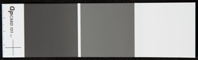 In a pinch, a piece of white paper will do, but try to choose one that appears less bright white because the bright white papers typically use optical brighteners that cause a blue color cast when exposed to ultraviolet light. The brighteners fool the eye into thinking it is a brighter white by adding a tiny blue bias. This works because of the way our eyes interpret color. However, your custom white balance will compensate and make things come out with a bit of a red/yellow cast. Usually this is minimal and so using a piece of paper with optical brighteners is still preferable to using nothing.


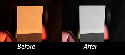
 Take a look at the photo above. It was taken with incandescent light and the camera was set for auto white balance. This magazine cover has a good B&W print that should have been sufficient for the camera to get a decent color balance. However, as is the case for many cameras (especially Canon DSLRs), the auto white balance fell far short of the mark.
 The image above was taken with the incandescent preset. The improvement in color compared to auto white balance is obvious. However, it still has a reddish hue that is not found in the real life subject. The RGB
 The photo above was taken after performing a custom white balance. As you can see, the image correctly depicts the black & white photograph on the cover of the magazine. A look at the RGB


 The chart below shows light from beyond ultraviolet down through infrared. The visible spectrum is shown as a rainbow fountain fill from violet to red. This chart is only an approximation of the characteristics for these light sources. The colors shown are not a perfect representation, but are intended only to mark where visible light starts and stops. The numbers along the x-axis are the wavelength specified in microns and the y-axix is amplitude in unspecified units.
 For years photographers used incandescent lights with special coatings that improved the spectral content. Nonetheless, these lights require immense amounts of power to achieve reasonable lighting levels and they get extremely hot, to the point that many, myself included, consider them unsafe and a bad choice considering the available alternatives.
 Here is a chart showing the emissions of sunlight (approximate) for a cloudless day. Note that its emissions extend into the ultraviolet on the left, and far into the infrared at the right, but the majority of its spectral intensity is concentrated within the visible spectrum.

