IntroductionWelcome to another installment of Studiography! It has been a few days since you last heard from me, sorry for the delay. This was supposed to be the last installment for the series on the
temperature of light, and I think it is about time to wrap things up, but after writing the material for this post on using the automatic method for obtaining a custom white balance, I realized that I also need to discuss the manual white balance controls, so I will finish up with one final post after this. If you are new to the blog, please feel free to peruse the earlier postings. I suggest going back to the beginning of the series on “
Light: In the Beginning” and read forward from there. The first post is a bit dry, but they do get better after that :-) All of the archived postings contain a link to the next post, so you can easily read them in sequence.
Raw Files (background info)
This post involves working with raw files, but at this time we will only be looking at white balance. For anyone unfamiliar with the term raw file, it is a file composed of data read directly from the camera's sensor. Most digital cameras use a monochromatic sensor, so in order to create RGB (Red, Green, Blue) color channels, the sensor is fitted with a color filter array composed of red, green and blue filters arranged in a symmetric pattern with one filter element for each photo site on the sensor. A program called a raw converter is used to interpolate a color and intensity for each photo site by using readings from surrounding pixels to create a jpeg or tiff file.
A study of the color filter array will yield a better understanding of what a raw file contains. There are several good articles already written on this subject and it is far beyond the scope of this posting, so rather than replicate what already exists in abundance, here are some links to follow for more information. DPReview, Wikipedia, Harvard, and John Savord's excellent writeup. An Internet search will produce a proliferation of similar reports.
All DSLR cameras and many digicams can output raw files either along side or in place of jpeg files. These files contain all 100% of the data from the sensor with no loss from compression or any other processing. In order to make use of these files, they must be processed by a raw converter. The camera manufacturer usually includes raw converter software as part of the package, but many people prefer the performance and/or features found in third party software, such as Adobe Lightroom, Adobe Camera Raw, Bibble, Capture One, et al.
For a number of years there has been a debate about the benefits of raw -Vs- jpeg files from the camera. At the end of the day one ends up with a jpeg file either way. However, the proponents of raw say that raw offers much more flexibility for processing, especially for white balance options. The jpeg shooters argue that in-camera jpegs are high quality and with features like picture styles, eliminate the need for shooting raw. In addition, in-camera jpeg files save a lot of processing time. For the record, I have been shooting raw for years and from my experiences, am thoroughly convinced that raw is the better work flow for me. That is all I'm going to say on the subject for now.
Custom White Balance (Intro)
So, let's get down to business. Virtually all raw converters offer a custom white balance tool. For the most part, all you need to do is select the white balance tool (eyedropper) and click on something that has neutral color content for a reference. This reference can be gray or near white, but cannot be black or pure white (0,0,0 or 255, 255, 255). For the examples in this posting, I am using the white patch from a QP Card.
You will need one image of the reference and will need the exposure to be reasonably close to correct and certainly not overexposed. If you have too hot of an exposure and the white reference has one or more blown color channels, the software cannot accurately determine its color. Once you click the tool on the neutral reference, the software will establish the white balance and you are done. It is very much like setting a custom white balance in the camera. For every shot taken under the same light source, you can use the same white balance settings or simply copy the white balance to those photos. This is one of the powerful features available to the raw shooter.
Custom White Balance Using Adobe Camera Raw (ACR)
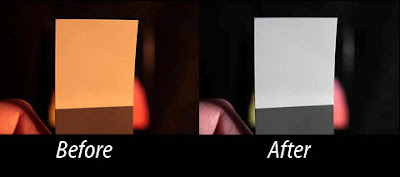
 As you can see from the image above, the light source is very warm and the camera's setting is not even close to correct. To set the white balance, simply click on the White Balance tool at the upper left, then click the eyedropper anywhere on the white patch.
 After balancing, you can see that the white patch is now a good representation of white. I took a color reading in the center of the patch. ACR is showing RGB values (1) of (154, 153, 151), which is very good. The “White Balance” control (2) now shows “Custom” and the “Temperature” display (3) is at 2600 degrees K. ACR does not show the tint on this screen.
Custom White Balance Using Bibble 4.10
 To set the white balance, simply click on the White Balance tool at the right, then click the eyedropper anywhere on the white patch.
 After balancing, you can see that the white patch is now a good representation of white. I took a color reading in the center of the patch. Bibble is showing RGB values (1) of (185, 193, 188), which is good. The “White Balance” control (2) now shows “Click White”, the “Temp” display (3) is at 2762 degrees K, and the “Tint” control is at -34, which adds a little bit of green.
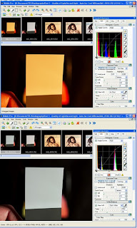
Custom White Balance Using Canon Digital Photo Professional (DPP) To set the white balance, simply click on the White Balance tool at the right, then click the eyedropper anywhere on the white patch.
 After balancing, you can see that the white patch is now a good representation of white. I took a color reading in the center of the patch. DPP is showing RGB values (1) of (147, 152, 156), which is acceptable. The “White Balance” control (2) now shows “Click White Balance”. Oddly, there is no temperature display for DPP.
Coming Next
It is now past my bed time, so I'm saving the part on manual white balance for next time. Until then...
-Gene
Continue on to Temperature of Light - part 8 (Manual White Balance with Raw Files using Canon's DPP)
 2009 is fast coming to an end and I wanted to get at least one more post out the chute before 2010 arrives. Today's post is a bit of a departure from the more pedantic nature of past postings. I thought it about time to start showing what can be done with some studio equipment in real world use. Keep in mind that by my way of thinking, a studio is any space where I can control the lighting to make photographs. While that includes the use of natural light, here in the greater Seattle area we have learned not to depend on the sun, so artificial lighting is more a way of life than a convenience.


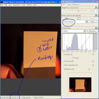 So let's take a look at how we can set the white balance manually using DPP. In this first image we are looking at the shot of the white balance card from earlier in this series. The light source was tungsten, so the appearance is heavily biased toward red (the color temperature is very warm).
 Next, we move the temperature slider until the white patch appears close to white. Measurements are taken by simply moving the cursor over the white patch. Note that the measurements will vary a little from spot to spot, but one quickly gets an idea of just how close to a neutral white the color is getting. Remember that neutral will be when all three of the RGB values are identical (or in this case, close).
 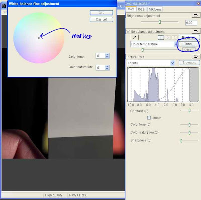 The “White balance fine adjustment” window pops open and in it we can see a color wheel that covers the rainbow around its perimeter, with a graduated fading to white toward the center. In the center is a a small movable marker. Moving the marker toward any color will add that color to the image. The closer it is moved toward the perimeter, then the more of that color gets added. Note that the colors for opposing sides of the color wheel are opposite colors. This gives you a visualization of what is happening with your image as you move the marker. Moving it toward red, adds red and subtracts cyan. Moving it toward blue, adds blue and subtracts yellow, and so on.
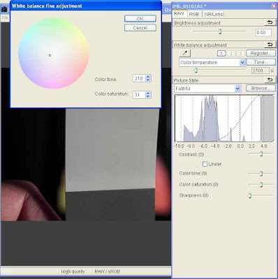 Since the RGB reading of 157, 148, 149 indicates a bit too much red, I moved the marker just a little towards cyan. Unfortunately, Canon did not think to provide a way to measure the effect on the image while the White balance fine adjustment window is open, so to test the impact of the adjustment, this window must be closed so a measurement can be made. Clicking “OK” will close the window without loosing the adjustment setting.
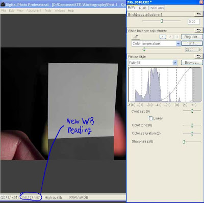 I performed a series of adjustments by opening and closing the White balance fine adjustment window until getting the near perfect white balance seen in the next image. The reading of (155, 156, 157) is very good, so I leave it at that.
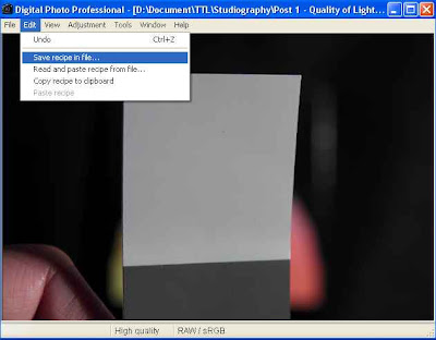 One of the advantages of using raw files is that you can set the white balance for all files shot under the same lighting. To make this easy, Canon have supplied a way to save the image settings (which Canon calls a “recipe”) into a file. Select the Edit menu and then Save recipe in file... as shown. You can give the recipe any name you like.
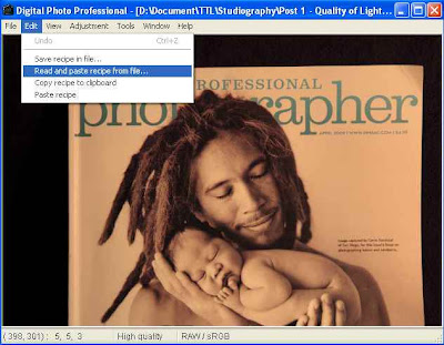 Since I have a photo that was taken under the same lighting as the white patch, I want to apply my saved recipe to it. I open the photo in DPP and then to make use of the recipe, select the Edit menu and then Read and paste recipe from file...
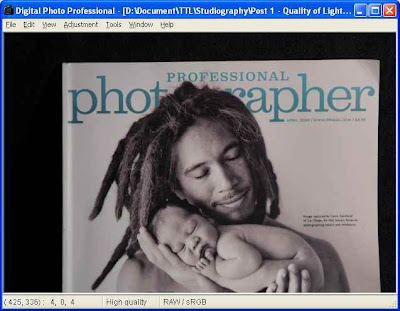 The file has inherited the saved settings and the result is a perfectly white balanced image.
 Now that we've covered the need for a custom white balance for in-camera jpegs, I thought I would take a stab at showing how to do it. This will apply directly to the Canon 450D, but with a little thought and perhaps consultation with the owner's manual, one should be able to apply the concept to other cameras as well.
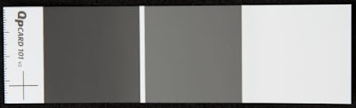 In a pinch, a piece of white paper will do, but try to choose one that appears less bright white because the bright white papers typically use optical brighteners that cause a blue color cast when exposed to ultraviolet light. The brighteners fool the eye into thinking it is a brighter white by adding a tiny blue bias. This works because of the way our eyes interpret color. However, your custom white balance will compensate and make things come out with a bit of a red/yellow cast. Usually this is minimal and so using a piece of paper with optical brighteners is still preferable to using nothing.
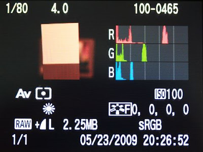


 Take a look at the photo above. It was taken with incandescent light and the camera was set for auto white balance. This magazine cover has a good B&W print that should have been sufficient for the camera to get a decent color balance. However, as is the case for many cameras (especially Canon DSLRs), the auto white balance fell far short of the mark.
 The image above was taken with the incandescent preset. The improvement in color compared to auto white balance is obvious. However, it still has a reddish hue that is not found in the real life subject. The RGB
 The photo above was taken after performing a custom white balance. As you can see, the image correctly depicts the black & white photograph on the cover of the magazine. A look at the RGB
 I didn't have any regular incandescent bulbs on hand, so I used the modeling lamp from one of my studio lights. It is no different from any normal halogen bulb except that it has an additional layer of glass to make it safer (JDD style). The spectral output is virtually the same as for an ordinary incandescent light bulb. They both burn a filament to create light. The only difference is that for one, the filament burns in a vacuum and for the other it burns in halogen gas.
 I had some “Reveal” incandescent bulbs available, so thought I would take a look to see if “Reveal's unique neodymium glass filters out dull, yellow rays unlike regular soft white bulbs...”
 The daylight balanced compact fluorescent has a completely different story to tell. As expected, the


 The chart below shows light from beyond ultraviolet down through infrared. The visible spectrum is shown as a rainbow fountain fill from violet to red. This chart is only an approximation of the characteristics for these light sources. The colors shown are not a perfect representation, but are intended only to mark where visible light starts and stops. The numbers along the x-axis are the wavelength specified in microns and the y-axix is amplitude in unspecified units.
 For years photographers used incandescent lights with special coatings that improved the spectral content. Nonetheless, these lights require immense amounts of power to achieve reasonable lighting levels and they get extremely hot, to the point that many, myself included, consider them unsafe and a bad choice considering the available alternatives.
 Here is a chart showing the emissions of sunlight (approximate) for a cloudless day. Note that its emissions extend into the ultraviolet on the left, and far into the infrared at the right, but the majority of its spectral intensity is concentrated within the visible spectrum.

 What we see is that there is now much more interaction because light from either extreme of the light source reaches all the way to the center behind our model. This results in a gradual feathering of the shadow that is considered very soft.

