The title for today's post is a bit misleading, as a grid doesn't really increase contrast, it only increases the directionality of light giving more control over where the light will and will not appear. What is really going on here is that a small light source at a low lighting ratio is being used to give a subtle, but important contrast boost to the face. The grid lets us place the contrast at a specific area with minimal impact on the rest of the lighting.
This is one of those, what would happen if, type experiments where I was pondering the idea of accenting the face a little bit by sculpting with light. As described in this post on Quality of Light, a large light source produces soft light (soft shadows) and a small light source produces hard light (sharp shadows). I love using a large light source. As I see things, the larger the light, the closer it resembles ambient room light by providing a gentle falloff at the sides.
I often use a large softbox or umbrella and add a small umbrella or softbox right next to it, Monte Zucker style. Another configuration that gets used is a single Softlighter, configured as a softbox umbrella. I like that it offers a relatively soft light with just enough punch for good shadows to define the contours of the face. It produces really nice light quality for a single light source, but not perfect in terms of falloff or facial contouring. Thinking about this prompted me to experiment with supplementing a large soft light source with a small light source to give a slight contrast boost (facial contouring). I reasoned that a grid would be helpful to control exactly where the small light would have its effect. It seemed too that the direction of light could come from an off-axis angle and might look best if coming from nearly directly above.
The Lighting Setup
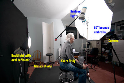
Here is the basic setup (click the image for a larger view). You can just see the key light, a 60” Photek Softlighter configured as a bounce umbrella. The gridded light is at top pointing down so that it just glances the face. The backlight is behind and wearing an Interfit oval backlight reflector.
Any normal key light setup would work for this. I wanted a large, relatively even light source, so chose to use the large bounce umbrella. My 48” x 32” Photoflex softbox would have worked just as well, but with a slightly different look. Perhaps I will try that some day. More likely I will use the Softlighter again, but put the diffusion screen on it.
The gridded light is using a 10 degree grid in a standard 7” reflector. I expect that similar results could be obtained with a gridded beauty dish. The choice of light modifiers is kind of personal. There is no right tool other than the one that fulfills your vision.
The Process of Getting There

This is my initial setup with the backlight facing (me) the subject (click the image for a larger view). You can see that the umbrella is relatively close and off to the side a bit. The gridded light is high and directly in front of the subject.

Placement of the gridded light is critical. I was using just the edge of light, which made the lighting effect even more dependent on positioning. This is an early shot showing just the grid light. Note how ig only hits the front of the face showing facial contours at the front and not the sides.
At this point I am not using a background light, so the backlight is turned toward the subject for back lighting. It is not properly adjusted either. In this shot I am looking up, which completely changes how the gridded light affects the face. Now it is acting more as a key light should. Not a bad effect, but not what I was after.

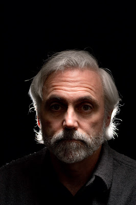
Here is the gridded light again, but this time just glancing the face and centered better. This is the effect I wanted. Note how the cheeks are nicely defined, the forehead is lit, and even the chin gets a bit of light.
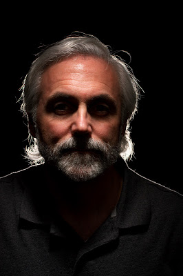
Here is a shot with fill added. It's getting there, but too much fill.
Again, this time with the fill turned down and positioning the face where I want it for the final image. Much better and closer to the pre-visualized image. I believe these are the settings used for this shot. I apologize for not taking better notes during this experiment.
f/8 - Camera aperture
f/5.0 - 60" Softliter
f/7.1 - Gridded key light
f/8 - Backlight
Once more, only this time with the glasses on. Not bad, but need to move the light to get rid of the shadow from the glasses and the backlighting has got to go!.
f/8 - Camera aperture
f/5.0 - 60" Softliter
f/7.1 - Gridded key light
f/8 - Backlight

This time the gridded light is moved slightly to accommodate the glasses and the backlight is turned around to illuminate the background. It's almost there, but the background is a bit dark and I would like just a touch more fill.
f/8 - Camera aperture
f/5.0 - 60" Softliter
f/7.1 - Gridded key light
f/8 - Backlight
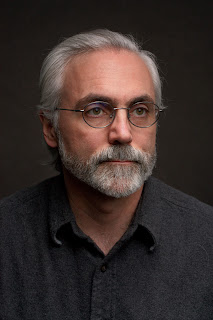
Here is the unretouched final image. This time I opened up the aperture 2/3-stop, turned down the key and fill for a 2:1 ratio and left the background lighting alone, so it is opened up a bit (please note that again, I am not absolutely positive about the settings, but I think this is right, and if not, it is very close).
F/6.3 - Camera aperture
f/4.5 - 60" Softliter
f/4.5 - Gridded key light
f/8 - Backlight
And the final image with some retouching applied in Bibble 5 layers. Retouching amounts to darkened the shirt, a slight vignette, burned down highlight on the nose, slight eye enhancement, and a minor color correction. I think this completes the image and gives a print ready file without Photoshop. Kudos to Bibble Labs.
As you can see, there are a lot of subtle variables to play with and this sort of thing is truly a season to taste recipe. What I took away from the experiment is that understanding the behavior of my light modifiers helps me to achieve my lighting vision and can even act as a catalyst for creating something that might otherwise have never come into being. To quote David Ziser, it is always good to ask yourself “I wonder what would happen if...”
Coming Next
That completes today's topic. I plan to incorporate more of this sort of posting in the future along with technical info and who knows what else. So many topics, so little time. Stay tuned for the next posting.
Until then...
-Gene


I think the final lighting is stunning. As a newbie who is still learning the basics, it scares me that there are so many subtleties! Oh well, I'll start with the basics and see how far I go. Thanks for the interesting post.
ReplyDelete